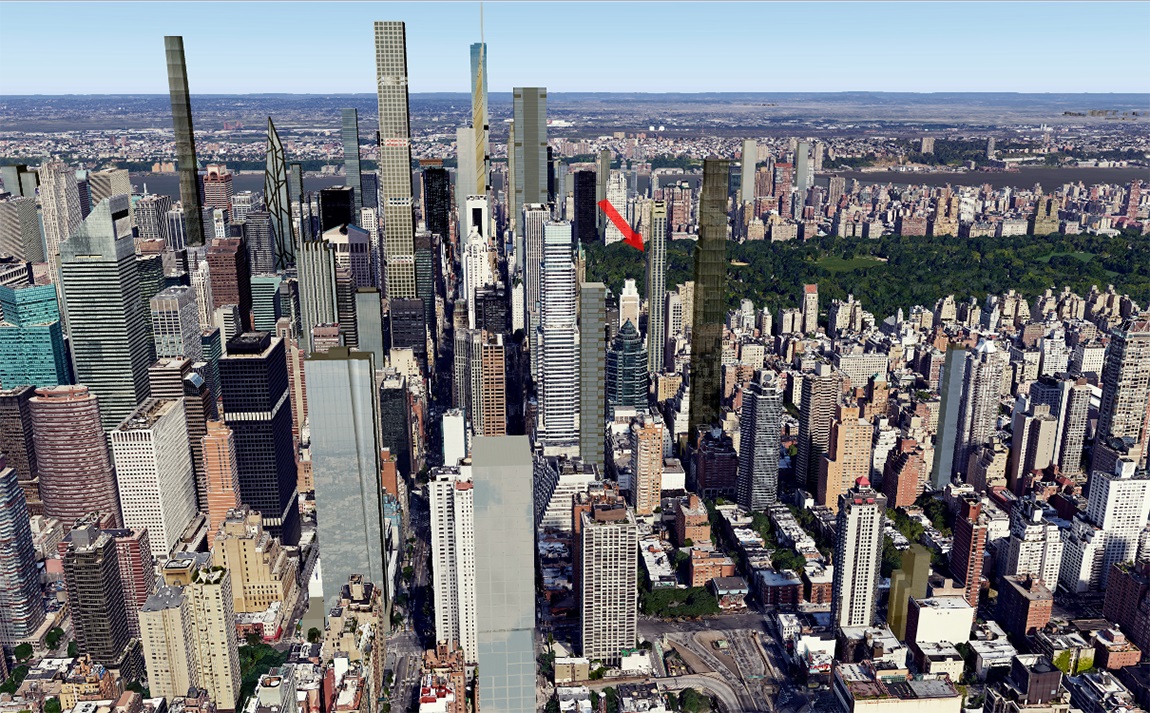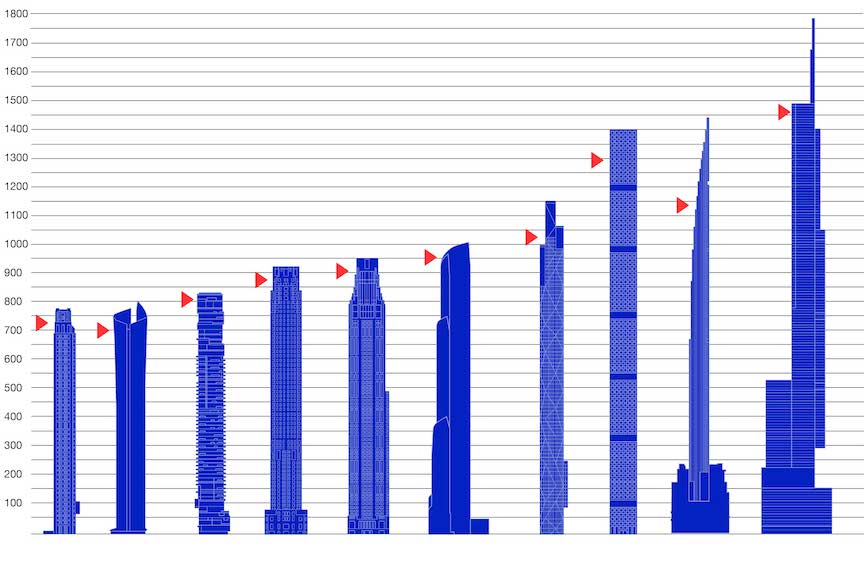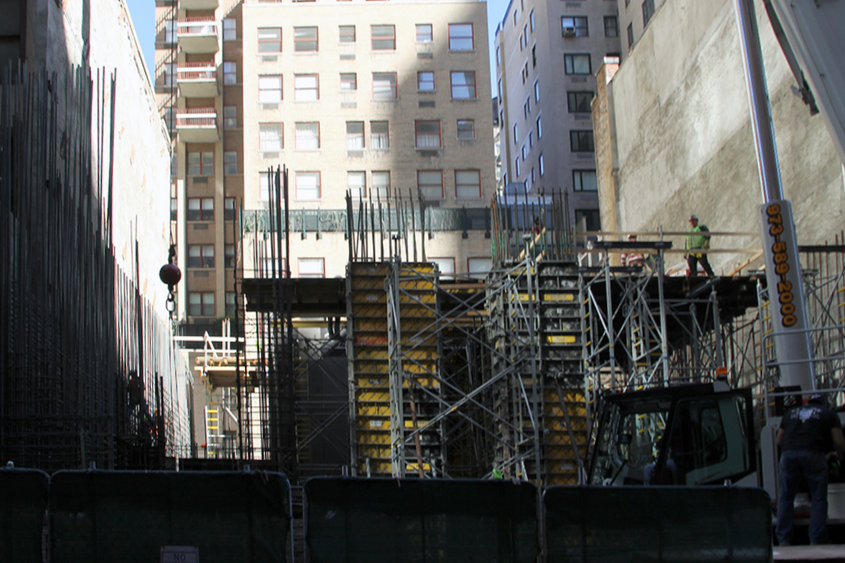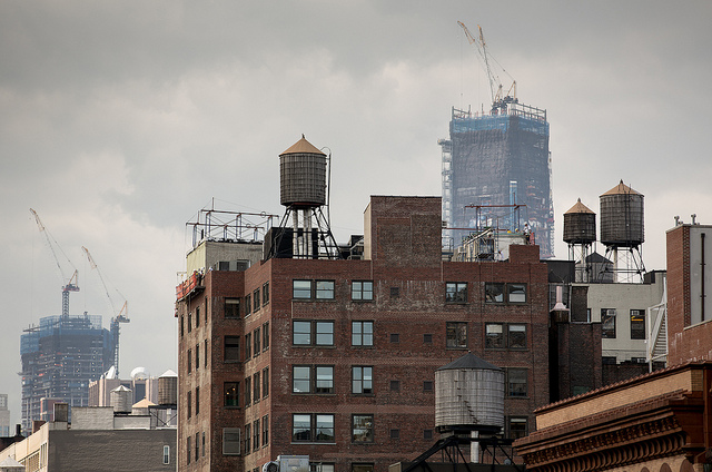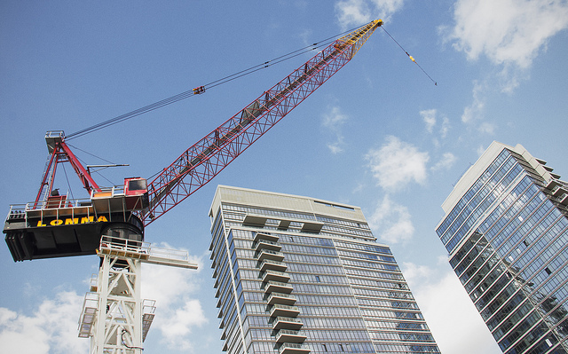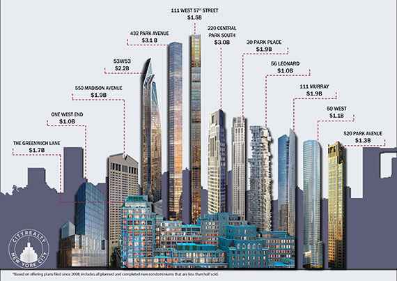
New York’s most expensive new condominium buildings get plenty of attention, but it’s nonetheless easy to forget just how expensive they, as a group, are (at least in the eyes of their developers). Just 12 buildings are projected to sell out for a total of $20 billion dollars, 44 percent of the total projected sellout of all 200 condo projects currently being built in Manhattan, according to a chart produced by CityRealty. (The analysis included planned and completed new condos where less than 50 percent of the units have closed, which is why One57 didn’t make the cut.) The heaviest hitters are also among the most famous: CIM Group and Macklowe Properties’ 432 Park Avenue, which projects a total sellout of $3.1 billion; Vornado Realty Trust’s 220 Central Park South, with a total projected sellout of $3 billion; and Hines’ 53 West 53rd Street, the MoMA Expansion Tower, with a total projected sellout of $2.2 billion. Though, buildings often fall short of the projected total sellout. It’s a good thing developers think they’ll hit such high revenues, because their costs are reportedly sky high as well. Earlier this month, The Real Deal reported that Vornado was spending $5,000 per foot to build the Robert A.M. Stern-designed 220 CPS. [CityRealty] – Ariel Stulberg Source: Most Expensive Condo Building NYC | Condo Development NYC


That’s 183,333,333 trips a year; 15,277,777 a month; and roughly 510,000 a day. And it likely took software developer Todd W. Schneider a long time to put all of that data into this stunning map of taxi pickups and drop offs over the past six years. Green boro taxis are represented in their signature color and traditional yellow cabs in white, with brighter areas representing more taxi activity. As Gothamist first noted, “Yellow cab pickups are concentrated south of Central Park in Manhattan, while drop offs spread north and east into Brooklyn, Queens and the Bronx; drop off and pickup activity snakes like a glowworm from Manhattan to the airports: along the Van Wyck Expressway to JFK, and by 278 and 495 to La Guardia.”
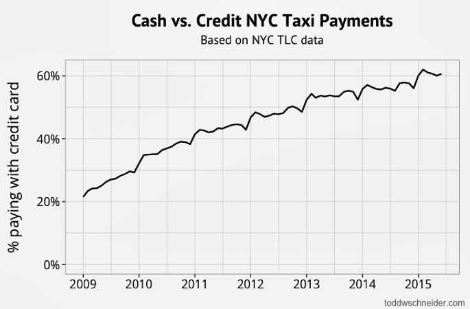
Using the TLC’s public data, Schneider also created charts and maps that show taxi travel compared with uber rides; weekend destinations of bridge-and-tunnelers; a late-night taxi index; how weather affects taxi trips; weekday drop-offs at Goldman Sachs and Citigroup; airport traffic; cash versus credit card payments; and the dramatic increase in North Williamsburg taxi activity.
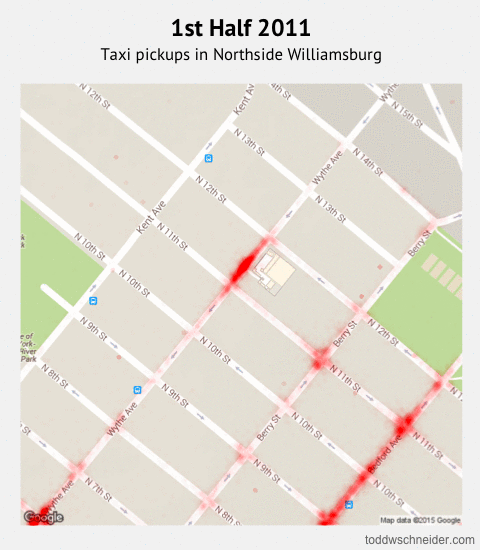
Above is a GIF showing the transformation of North Williamsburg taxi activity from 2011 (when the green cabs were introduced) to 2014, the area with the largest increase in taxi pickups. 72 percent of these pickups occurred late night, and we can see some of the specific spots where this is most prevalent, such as the Wythe Hotel, Output nightclub, and Verboten nightclub.
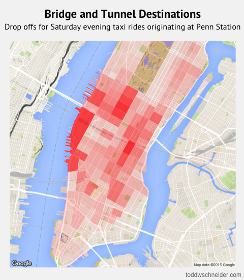
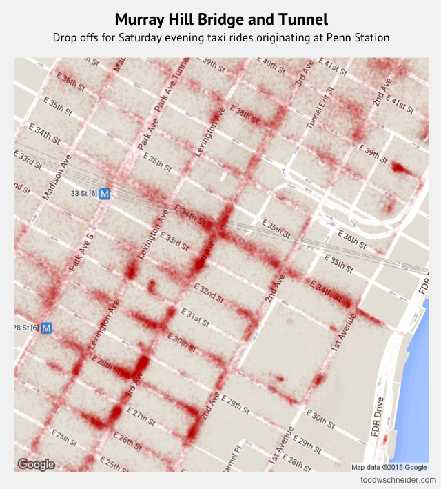
It’s also interesting to look at where those from neighboring locales go on the weekend. Though the first map above shows taxi pickups originating at Penn Station, most passengers are not going very far, ending up in the Meatpacking District, Chelsea, and Midtown. Not surprisingly, Murray Hill is the number one drop off spot, often known as the heart of the bridge and tunnel crowd.
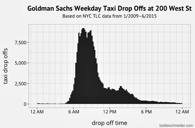
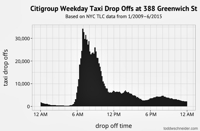
“We’ve already covered the hipsters of Williamsburg and the B&Ts of Murray Hill, why not see what the taxi data can tell us about investment bankers, yet another of New York’s distinctive subcultures?” asks Schneider. As his graphs show, Goldman Sachs employees’ average drop off time is 7:59 a.m.; Citigroup is 7:51 a.m. Those taking taxis to these offices mostly get picked up in the West Village, Chelsea/Flatiron/Union Square, and Soho/Tribeca (in that order).
“I’m certainly not the first person to use the public taxi data to make maps, but I hadn’t previously seen a map that includes the entire dataset of pickups and drop offs since 2009 for both yellow and green taxis,” says Todd W. Schneider. To see the rest of his maps and charts, visit the project page HERE >>
[Via Gothamist]