
If you ride the subway to work in the morning, it may feel at times like you're part of a herd of cattle being kicked in the shins on the way to the slaughter, but here's a news flash for you: it could be worse. That's because a majority of the land mass of the city is not in easy walking distance to a subway station, and do you know how much of a pain in the neck it is to own a car around here?
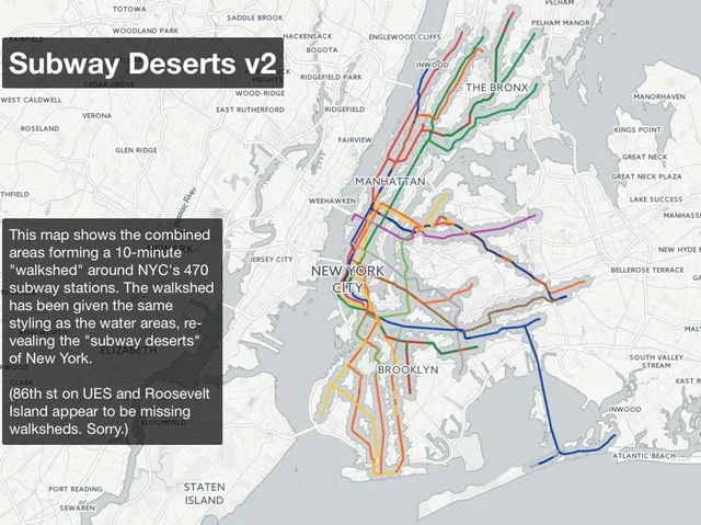
Chris Whong works for the Department of City Planning by day, making maps and doing data analysis, and in his free time he makes still more maps for "fun." One he drew up last yearcaught our attention. It shows the areas more than 500 meters from a subway stop as islands floating apart from the well-serviced swaths of the city. Whong dashed off the map in about 30 minutes and was surprised when it garnered mentions from New York media outlets.
"It's something everybody can relate to," he said, reflecting on the attention the first map got. "I probably would have put more effort into it had I known."
Now, after a longer late-night mapmaking session, Whong has a new and improved version of the subway desert map that is easier on the eyes. Also, Whong took into account criticism that 500 meters or 0.3 miles as the crow flies is not the best measure of walkability, so this time he used OpenTripPlanner data to base the buffer zone on 10 minutes' walking distance from a given subway stop.
The resulting vision of New York is at once obvious and fascinating. Manhattan is heavily serviced by the subway apart from the East Village, and the far east and west sides. Much of the Bronx outside of four corridors is out of reach, as is most of the vastness of Queens, southeast Brooklyn, and the high-priced Williamsburg waterfront. Some of these areas are serviced by express buses, Metro North, and/or Long Island Rail Road, which Whong said he considered including. Ultimately, though, he opted to keep the concept simple (and cut out Staten Island—sorry SI Railway riders).
"There are lots of iterations," he said. "People have said 10 minutes is not too far to walk to the subway and 15 minutes is a better threshold for deserts. I encourage everybody to copy my methodology. There’s plenty of room for more analysis, but this was my cutoff point."
For instance, he said, using the same data sets, it would be possible to then incorporate census data and count how many people are within a certain distance of all subway lines, or a particular one, and how many people served by a particular public institution have ready access to a particular area.
Whong said the map made him appreciate living close to a subway station, and that the map could serve as a prompt for exploring lesser-known parts of the city, not that he has used it that way yet.
"It gives you a visual cue to explore them a little bit," he said. "You can visualize yourself there, zoom in on the map and look around, and say, 'Is that a place I should visit?' Because they’re not easy to get to."
Whong called the map an "open data success story," and praised the Department of Information Technology and Telecommunications, OpenStreetMap, and OpenTripPlanner, for providing the data he used, and Carto DB for the mapmaking platform.
The New Yorkers with the longest commutes tend to be struggling financially—two thirds of New Yorkers who commute more than an hour each way make less than $35,000. Politicians and activists have floated proposals to reduce fares for Metro North and LIRR train trips within the city, which the MTA is very tentatively looking into. Express bus trips currently cost $6.50, and an LIRR peak ticket from Jamaica to Atlantic Terminal will currently set you back $10. The J train from Jamaica, on the other hand, is torturously local if you're trying to get anywhere near Manhattan.